This project is about making a magazine about yourself. The most the I liked about doing this project was doing the poly art of myself. We had to think of our own magazine name, for example mine is "FRaN" because Francisco is my last name. I made an art magazine because I like drawing and I like being creative. We also had to make fake headlines for the magazine.
For my magazine cover I decided to go with my interests for the articles, and a skateboarder kind-of picture. For the picture I got it taken at Tec Voc (Go Hornets) and for the text I used the font Helvecta Pro Bold.
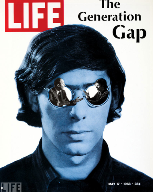
The project was to make a magazine cover that expresses you. I took insipration from the Life magazine, specifically "The Generation Gap". I put myself, with 2 people from my glasses arguing, this represents how I constantly doubt myself. The magazine I made is called "Drive" because the thing that keeps me going is a "Drive" to strive for a good life. I chose the title because the current economy is drastically different from the economy not even 100 years ago, which changes many different things in life. The 4 different headlines are based on the same thing I stated in the previous sentence, how my addiction to gaming affects my studies, and where to go from this point.
For my photoshop project, I decided to go with an assignment that related to watercolour. Watercolour art has, and still is something i'm fascinated by. Making my own with minimal art skills and free downloadable brushes has definitely been fun. The steps and skills needed for this project are pretty basic. Like the pop art assignment, a prepared cutout image needs to already be on hand. The picture I used for this one has a cutout filter added on to it, but feel free to use any filter that complements what you're going for. The altered image is then placed on a layer, where you can start adding the downloaded brushes on a different layer so it doesn't affect/tint the image. The skills we learned from the Andy Warhol assignment benefits you for this one.
For my project, I decided to do a faded landscape image that I found online. It was a little bit difficult because the website that had the instructions, didnt explain it very well so I had to figure most of it by myself.
How I did it: I first chose 2 different pictures, a self picture and a landscape picture I took 2 years ago. I changed the self picture into a silhouette by making the picture entirely black. I then added the landscape picture into a layer mask and added colors to make it look nicer.
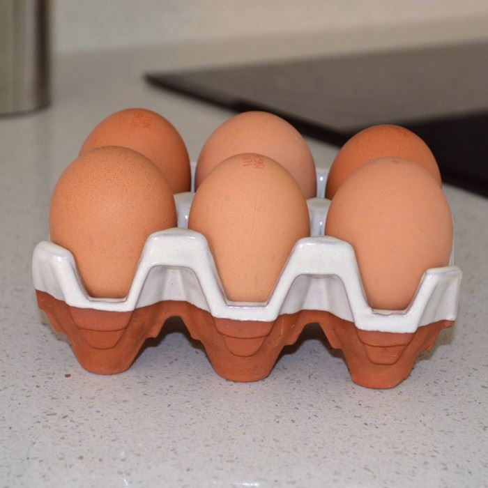
This assignment was photo manipulation where you crop out people's heads and replace the eggs on the egg tray with the heads. First, I had to trace the front part of the egg tray to copy and paste. After that, I took photos of each teacher and used the lasso tool to crop out their heads. I then put the three layers of the heads behind the egg tray layer to manipulate the eye into thinking it was three plain, shiny eggs. I did some finishing touches with the dodge and burn tool to cast shadows and lighting onto the eggs in the background.
This is a photo manipulation of miniature art. I made it look like as if the people in the photo were tiny ants compared to real life human structures. It was very simple and easy to create this project. Anyone of you could also do this at home if you buy yourself a photoshop engine.
Just grab photos of people you may know and crop their size much smaller but keep the landscape you're placing them on bigger to make it look like they're ants.
For my Photoshop assignment I decided to do a translucent sunset picture/ picture of myself. These are the two pictures that I used for this project, the idea was the combined both pictures and make both translucent. You had to turn your photo of yourself into a silhouette, add a layer-mask then adding your sunset to the layer mask. Once you press back to the original photo it will show the sunset, you must change the opacity of your picture of yourself. I added an extra effect by changing the background color and adding more color to my sunset.Overall it was quite difficult to figure out and had a-lot of problems along the way. I'm am very happy with the way it turned out!
________________________________________________________________ The PhotoShop assignment I chose to do was a Polaroid Collage. I chose to do this because (in my opinion) it stood out. The steps I took to complete this assignment were:
1.The Polaroid. For the polaroid I drew two rectangles. The first one was a black rectangle, and the second was a larger white one.
2.Polaroid Background. For the 'picture' of the polaroid I selected the black square with the magic wand, switched to the background image, and hit control J. (Ctrl J switches the black to the part of the image where the shape is located)
3.Repeat. After my first polaroid I continued to fill the 'canvas' with MANY more 'Polaroids'. The way I accomplished this was repeating step two, but moving the 'polaroid' before pressing Ctrl J.
4. (optional) Add a background. For my 'Polaroid Collage' I did not add a background due to the canvas being to small (or the Polaroids being to large), but if you decide to do this, you Are able to add a background by deleting/replacing the original image.
For this assignment, I chose to do this assignment because it looked pretty cool. You take a picture of a small visual, maybe an object, and a picture of a texture. Then you place the visual and the texture and place the texture on top of the visual. The next thing you do is go to Enhance -> Adjust Color -> Adjust Hue/Saturation, and then you move the saturation slider all the way to the left. After that you select the layer with the texture, and then you click the tab that says "Normal", select overlay. The final step is to right click the texture layer and select "Create Clipping Mask", and voila, your visual is textured.
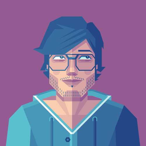
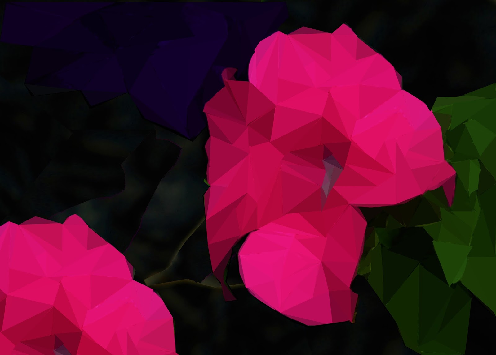
The Photoshop assignment I chose to do for term 2 is called Poly Art. For this assignment I decided to do a Poly Art of myself. To do this I had to insert a photo of myself to use as an outline then I used the Polygonal Lasso Tool to make shapes based on different shades and colours of my photo. To find the colour for the shapes I used the Colour Picker Tool to take a sample and then used the Paint Bucket Tool to add the colour.
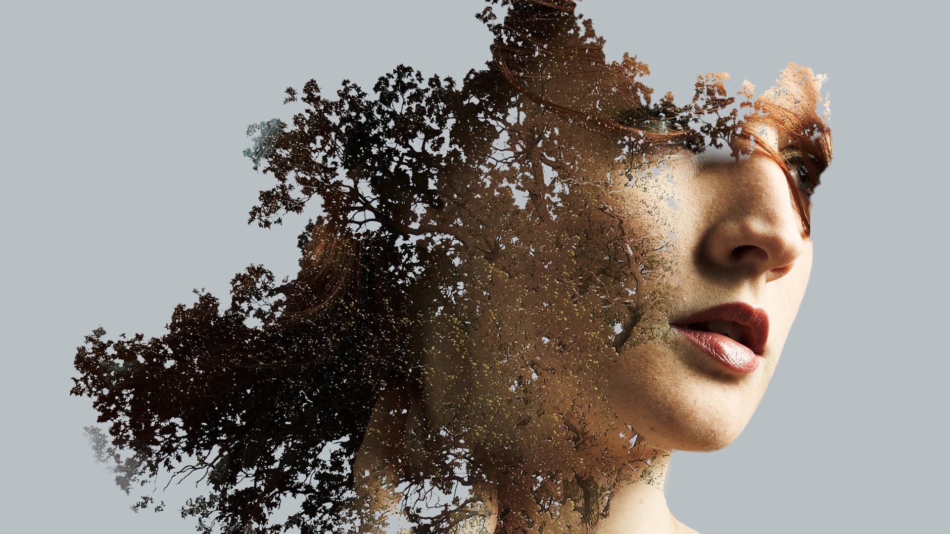
For my project I decided to do a double exposure effect using a two images for the project. One of a portrait and one of a leafy tree.
First, I picked a portrait of my cousin since it was the only picture that I actually took a picture of someone, I then picked one of the tree pictures that I have. I selected the tree first and layered it. Its pretty easy once you get the hang of it. It's nothing like the Andy Warhol assignment and this is much more complicated.
All you need to do is mask the tree first and get rid of the extra background and add a black and white filter. Then select the part of the portrait that you want to be visible in the edit. To make a fading effect use a the gradient tool and make a line from left to right until you reached the level of transparency you want for your picture. to get rid of the excess portrait just erase them using the erasing tool. If you want some extra effects you can add a filter to spice things up.
For a better understanding on how to do this kind of effect there's a video and the website is down below.
This assignment was a challenging one for it was hard to edit the original image and this was taken by me it where just edited it had simple steps to it but in the end it was a fun to create and image that i myself took.
This Photo looks different in photo shop than in here.
For this photo shop assignment I chose to create a galaxy, or a nebula. Using various filters and brushes, along with a gradient with my colour of choice I made a galaxy style photo. The process included using multiple layers of different types to create this final product.